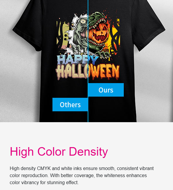


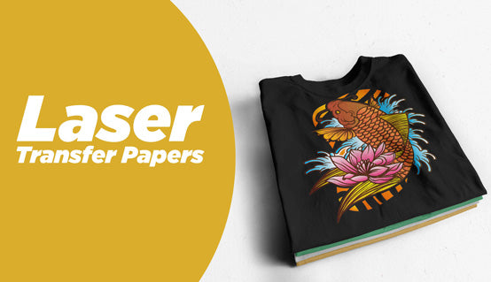


Why color matters in heat transfer printing
In the world of custom printing, every detail counts, especially when it comes to choosing the right heat transfer paper. One of the most common phrases found on packaging or product descriptions is:
- “For use with white or light-colored fabrics.”
At first glance, it seems straightforward. But ask any printer or entrepreneur who's tried using light transfer paper on a beige or pastel shirt, and you’ll hear the same question:
What exactly is considered a light-colored fabric?
The answer isn’t always black and white. A shirt might appear light to the naked eye but still distort the final result if the design has subtle gradients or white elements. Choosing the wrong paper can lead to wasted materials, poor color accuracy, and disappointed customers, all things a growing business can't afford.
In this guide, we’ll break down what light-colored really means, when to use light transfer paper, and how to ensure every print comes out crisp, vibrant, and professional.
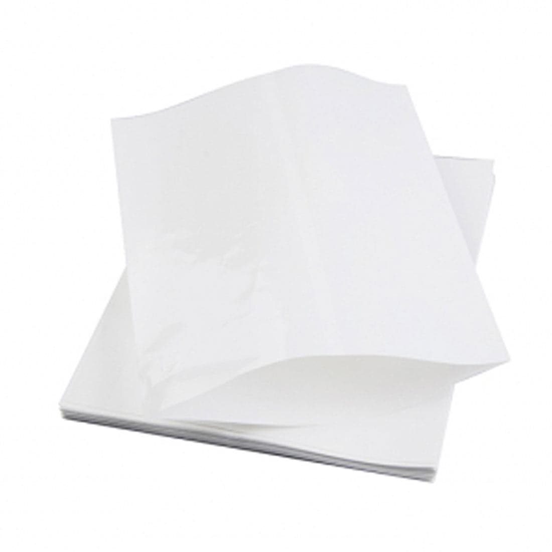
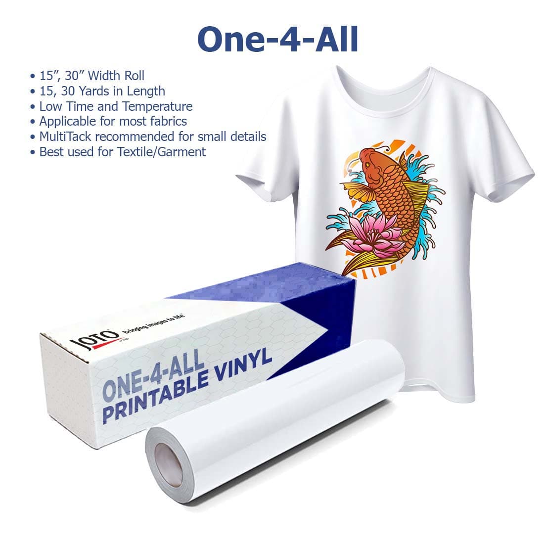
Understanding light heat transfer papers
Light heat transfer papers are specially formulated for use on white or very light-colored fabrics. They are typically thinner than dark transfer papers and leave a softer finish on the garment. Their key characteristic (and limitation) is that they rely on the shirt itself to provide any white areas in a design.
That’s because most desktop inkjet and laser printers don’t print white ink. Instead, they leave those areas blank, allowing the fabric color to show through. This works beautifully when printing on white garments, but can cause serious issues when used on colored ones.
For example, if you print a design with white text or pastel tones on a pink or light blue shirt, those lighter areas will either disappear or take on the color of the fabric. The result? Dull, inaccurate, or distorted prints.
That’s why it’s critical to understand the design-to-fabric interaction before deciding to use light transfer paper.
How to know if a fabric is “light-colored”

The term light-colored fabric can feel ambiguous — and that's because it is. There's no official Pantone scale to define it. Instead, you need to think in terms of contrast and color interference between your design and the garment.
A general rule of thumb:
- If the shirt is lighter than the lightest color in your design, it may work with light transfer paper.
But even then, success isn’t guaranteed. For example, a pale yellow shirt might still alter the appearance of light blue text. Similarly, printing on heathered or textured fabrics can introduce unwanted tone variations.
Ultimately, the true test is how the fabric interacts with your specific design, not just how the shirt looks by itself.
Image types and their compatibility
Not all designs interact with fabric color in the same way. When using light transfer paper, the composition of your image (not just the fabric) determines whether the result will be acceptable, good, or completely unusable. A design made entirely of bold black shapes behaves very differently from one filled with soft gradients or subtle shadows.
Next, we’ll review the three most common types of images used in custom printing and how they perform when applied with transfer paper for light fabrics:
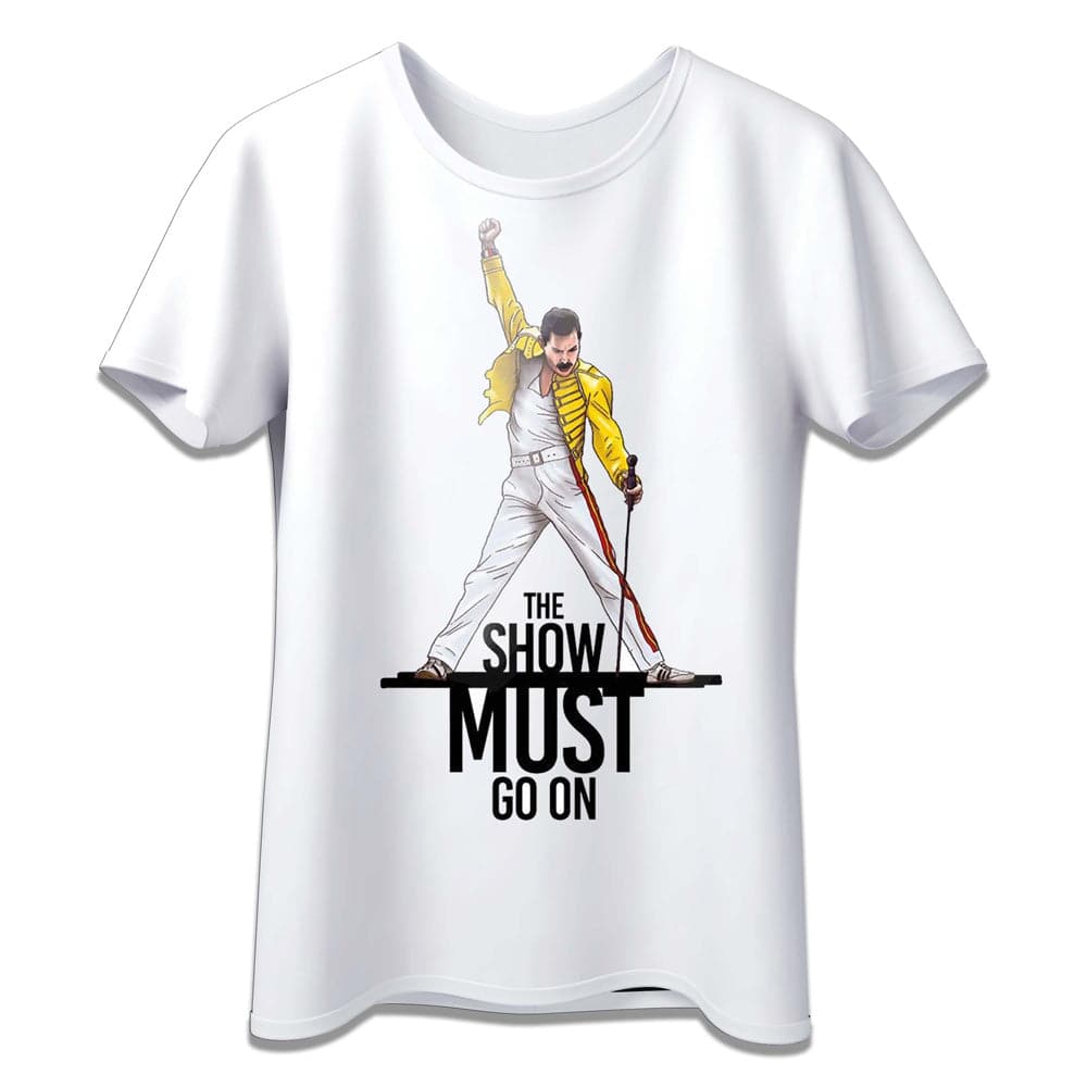
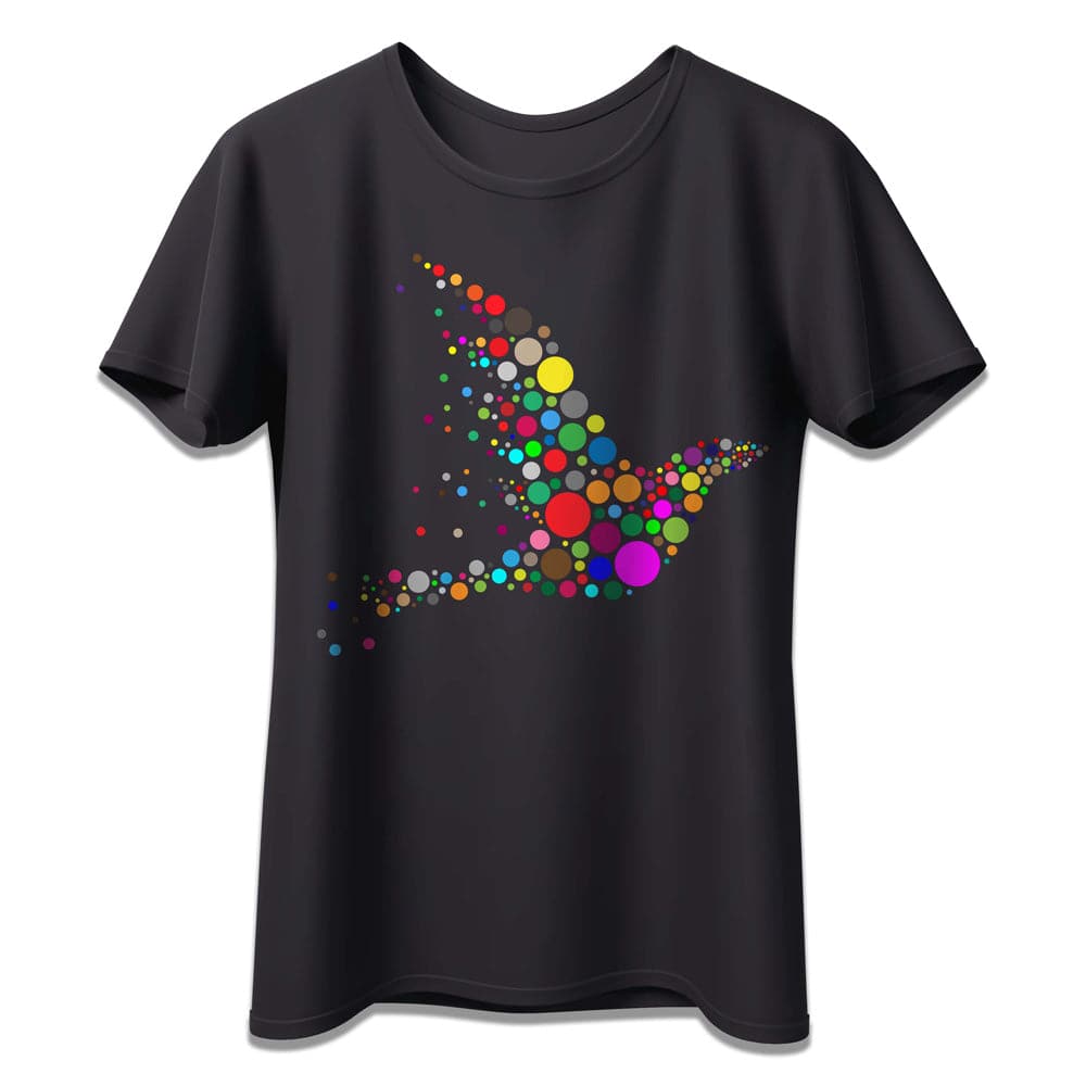
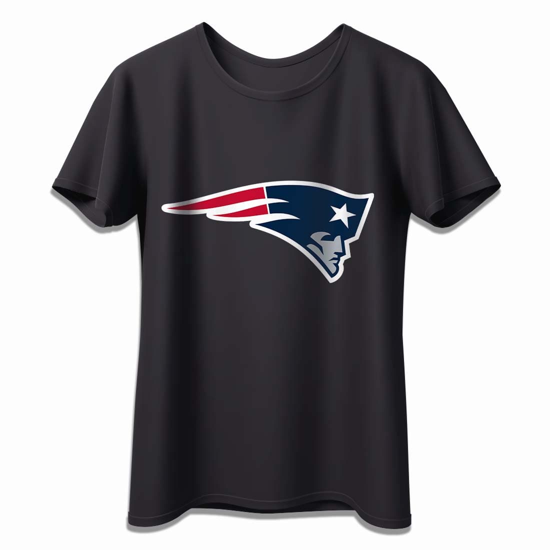
1. Black-only designs
Designs that are completely black, such as logos, text, icons, barcodes, or vector illustrations, are generally the most compatible with light transfer paper. That’s because black ink offers strong contrast against most light-colored backgrounds.
Best results:
- White
- Light gray
- Pink
- Light blue
- Pale yellow
💡 Pro tip: Trim carefully around the text or artwork to avoid leaving a visible shiny polymer background. If left untrimmed, this border can dull the overall appearance of the design.
While black may still appear on darker tones like red or navy, it will lose clarity and sharpness, reducing its impact.
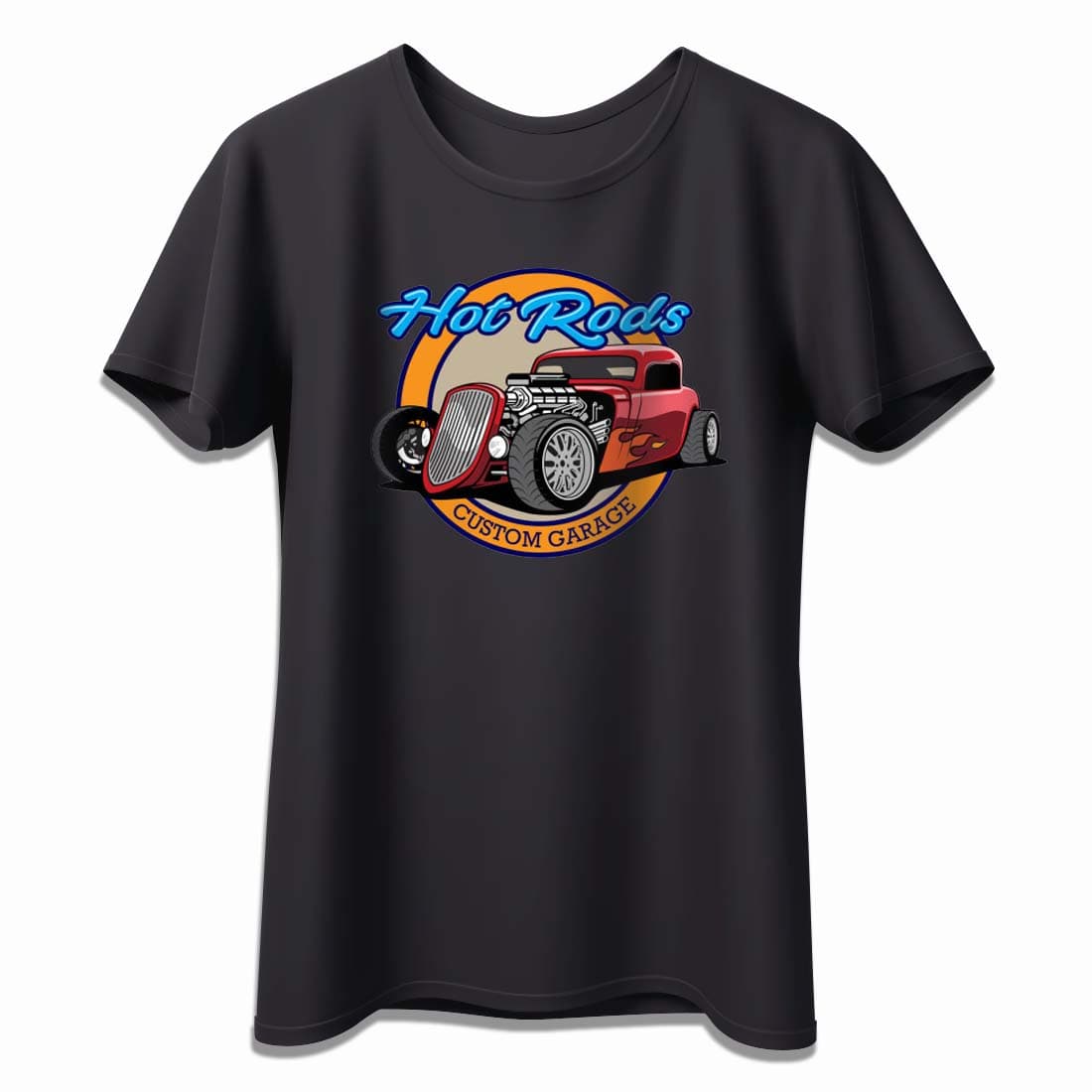
2. Solid colors (non-neutral)
Designs made with bold, non-neutral colors like red, green, or royal blue can sometimes work with light transfer paper, but the shirt color plays a much bigger role in how the final product looks.
What works:
- White and beige fabrics provide neutral backgrounds.
- Pale pink or sky blue shirts may also work with designs in complementary colors.
What to avoid:
- Using similar hues (e.g., red on pink), this reduces contrast.
- Expect some hue distortion as the underlying fabric may “bleed” into the design through transparency.
If your design includes only strong primary or secondary colors and no light tones, and the shirt is light enough, you may achieve an acceptable result — but it's always safer to test.
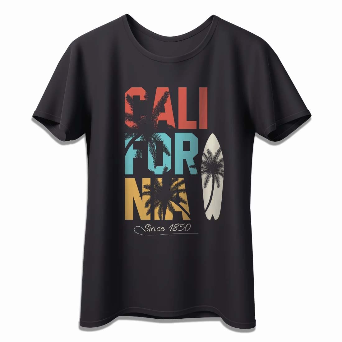
3. Gradients, drop shadows, and light tones
Designs that include light colors, transparency, or soft edges are the most vulnerable when using light transfer paper. Examples include gradients, watercolor-style art, pastel tones, drop shadows, and highlights.
Why it fails: These types of effects rely on subtle tone differences and often include white or near-white areas. Since light transfer paper doesn’t supply white ink, these areas will be fully or partially transparent, allowing the shirt color to distort the image.
Use only on:
- Pure white fabric
Trying to print a soft gray shadow or light blue gradient on anything but white will result in unpredictable blending and muted tones. This often leads to disappointment, especially in commercial settings.
Examples and outcomes
Understanding how your design behaves on different shirt colors is essential for professional results. Below is a quick reference table based on real-world printing scenarios. Use it to anticipate how well your design might transfer when using light heat transfer paper.
This kind of visual planning helps you avoid common printing mistakes, especially when working with expensive blanks or on bulk orders.
| Design Type | Recommended Shirt Color | Expected Outcome |
|---|---|---|
| Black-only design | White, pink, red, light blue | High contrast, clean look; trim recommended |
| Bold solid colors | White, beige, pale pink | May work, but some color shift or fading is possible |
| Light tones and gradients | Only white | Poor results on colored fabrics; fading and distortion |
| Drop shadows / soft edges | Only white | Shirt color will interfere and reduce visibility |
| Transparent designs with white | Only white | White will disappear, making image look incomplete |
Why printers don’t use white ink
One of the biggest limitations when working with light transfer paper is rooted in printer technology. Most desktop inkjet and laser printers, the kind commonly used in small and medium print shops, do not print white ink.
In these printers, white is treated as the absence of ink. So when your design includes white areas or light tones, the printer simply leaves those parts blank. This means that:
- On white fabric, those blank areas look fine, because the shirt provides the white background.
- On colored fabric, those same areas become transparent, allowing the shirt’s color to interfere with the design.
To print on dark fabrics or preserve white details, you need dark transfer paper, which includes an opaque base layer that acts as the white background.
Light vs. dark transfer paper: when to use each
Choosing between light and dark heat transfer paper is not just a matter of fabric color, it's about image composition, desired finish, and print quality.
Here’s a comparison to help you decide which paper is right for your project:
| Feature | Light Transfer Paper | Dark Transfer Paper |
|---|---|---|
| Best for | White or very light-colored fabrics | Any color, including black |
| White ink support | ❌ No — printers leave white areas blank | ✅ Yes — white base layer included |
| Image vibrancy | Good on white; fades on colors | Strong, consistent across all shirt colors |
| Fabric color interference | High — fabric affects image colors | Minimal — colors stay true |
| Thickness & feel | Thinner, softer finish | Thicker, may feel more layered |
| Trimming needed | ✅ Yes — to remove excess film | ✅ Yes — but less noticeable if image has full bleed |
| Cost | Lower | Higher |
Recommendation: Use light transfer paper only when your design is bold and your fabric is white or very light. For more complex or colorful designs, or whenever you’re unsure, opt for dark transfer paper for consistent, high-quality results.
Expert tips from Joto
After helping thousands of customers get the best results with their custom printing projects, we’ve learned a few key tips that make all the difference — especially when working with light transfer papers:
- Always test before committing. Use a scrap piece of fabric or an old shirt to test your design before starting a full batch.
- Use vector graphics for bold results. Designs with clean lines and strong contrast print better on light-colored fabrics.
- Trim your design carefully. Untrimmed designs leave a visible film around the edges, especially on colored shirts.
- Press at the correct temperature and time. Follow your heat press instructions precisely. Under- or over-pressing can ruin a good design.
These small steps help you deliver professional-looking results while saving money and materials.
Common mistakes to avoid
Even experienced printers run into trouble when using light transfer paper, especially if they're working fast or experimenting with new designs. Here are the common mistakes you must avoid:
-
Using light paper on mid-tone or dark shirts: Even beige or light grey can interfere with lighter image elements.
-
Printing pastel or white-heavy designs on colored fabric: These will almost always look faded or distorted.
-
Skipping the trimming step: Leaving the full sheet untrimmed results in a visible, sometimes shiny, polymer border around your design.
-
Assuming all “light” shirts are equal: Color perception is subjective — test before producing at scale.
Avoiding these mistakes can be the difference between a shirt your customer loves and one that gets returned.
Final thoughts: Choose based on your design, not just the shirt
When it comes to using light heat transfer paper, the shirt color is only half the equation. The true deciding factor is your design. If your artwork includes black or bold colors and you're printing on white or very light fabric, light transfer paper is a cost-effective and reliable choice.
But if your design features white, light tones, gradients, or drop shadows, even a slightly tinted fabric can compromise the result.
Always think in terms of contrast, opacity, and how much your design depends on a white base. If there’s any doubt, dark transfer paper provides more control and consistency across all fabric colors.
Choose wisely, your final product depends on it.
Looking for the Right Paper?
At Joto Imaging Supplies, we offer a full range of light and dark heat transfer papers designed to help you get professional results — no matter your project or fabric color.
Explore our collection:
Need help choosing the right paper? Contact our team, we’re here to support your business every step of the way.